July 9, 2021 . 4 MIN READ
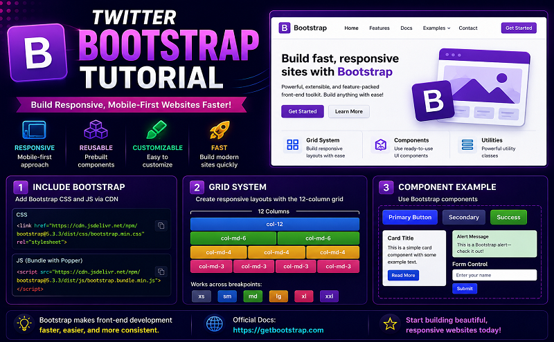
Twitter bootstarp is a toolkit to create websites. Twitter bootstrap mainly include basic html and css for creating Grids, Layouts, Typography, Tables, Forms, Navigation, Pagination, Popover, Alerts etc.
Twitter Bootstrap browser supports:
Twitter bootstrap supports following browsers:
How to obtain twitter bootstrap:
Download twitter bootstrap from
https://github.com/twitter/bootstrap or http://twitter.github.io/bootstrap/getting-started.html
Once downloaded unzip the file. Then you get
Css file, js file and img.
Css folder contains
Js folder contains
Img folder contains
Bootstrap design system:
There are three types of design system in bootstrap.
Grid System :
The default grid system of bootstrap is 940 px wide and 12 columns. It has four responsive variations for phone, tablet portrait, tablet landscape, small desktop and large wide screen desktop.
There are 12 span for 940 px wide screen. Different span has different wide.
And there are also 12 offset for 940 px wide screen.
Now look how to create grid.
Suppose we want to make one grid.
<!– html file — >
<div class=”row”>
<div class=”span12″>
<p>This span size is 940px</p>
</div>
The Output Is:
Example Of multiple Grid:
<div class=”row”>
<div class=”span12 back”>
<div class=”span4 back1″>
<p> Span4 default width is 300px </p>
</div>
<div class=”span6 back1″>
<p> Span6 default width is 460px </p>
</div>
</div>
</div>
This code generate following output:
Those two is simple example of grid system.
You can modify or create new span size if you need. But careful about size calculation.
Fluid Grid System:
In Fluid Grid system span is calculated by percentage place of px.
Layout System:
Layout system provide a common fixed width.
To Make Responsive:
For responsive web deign to work, you need to create a CSS which comprises of styles suitable for various devices sizes, or better to say for various device size ranges. Once the page is about to load on a specific device, using various font end web development techniques like Media Queries, the size of the viewport of the device is detected, then the styles specific to the device is loaded.
To make responsive follow two step.
Step1: Add meta tag
<meta name=”viewport” content=”width=device-width, initial-scale=1.0″>
Step2: Add bootstrap-responsive.css
<link href=”assets/css/bootstrap-responsive.css” rel=”stylesheet”>
If you look at the responsive css file there are various sections starts with @media.
You can modify those css to make your website responsive.
Look at the following example ::
<div class=”row”>
<div class=”offset1 spanadvertise”>
<div class=”spaninneradvertise”>
<div class=”advertisedivproperties”>
<h5 class=”addvertiseheadingposition”>Address Labels</h5>
<img class=”addressimageposition” src=”image/address.png” />
<div class=”advertisesubdivproperties”>
<p class=”p_properties”>Ut wisi enim ad minim veniam, quis nostrud exerci tation</p>
<h4>$15.00</h4>
<div class=”addressbuttonposition”><a><img src=”image/button.png” /></a></div>
</div>
</div>
</div>
<div class=”spaninneradvertise offset14″>
<div class=”advertisedivproperties”>
<h5 class=”addvertiseheadingposition”>Envelope Printing</h5>
<img class=”addressimageposition1″ src=”image/envelop.png” />
<div class=”advertisesubdivproperties”>
<p class=”p_properties”>Ut wisi enim ad minim veniam, quis nostrud exerci tation</p>
<h4>$30.00</h4>
<div class=”addressbuttonposition”><a><img src=”image/button.png” /></a></div>
</div>
</div>
</div>
<div class=”spaninneradvertise offset14″>
<div class=”advertisedivproperties”>
<h5 class=”addvertiseheadingposition”>Gift Stickers</h5>
<img class=”addressimageposition1″ src=”image/gift.png” />
<div class=”advertisesubdivproperties”>
<p class=”p_properties”>Ut wisi enim ad minim veniam, quis nostrud exerci tation</p>
<h4>$16.00</h4>
<div class=”addressbuttonposition”><a><img src=”image/button.png” /></a></div>
</div>
</div>
</div>
<div class=”spaninneradvertise offset14″>
<div class=”advertisedivproperties”>
<h5 class=”addvertiseheadingposition”>Holidays</h5>
<img class=”addressimageposition1″ src=”image/holydays.png” />
<div class=”advertisesubdivproperties”>
<p class=”p_properties”>Ut wisi enim ad minim veniam, quis nostrud exerci tation</p>
<h4>$25.00</h4>
<div class=”addressbuttonposition”><a><img src=”image/button.png” /></a></div>
</div>
</div>
</div>
</div>
</div>
The output is
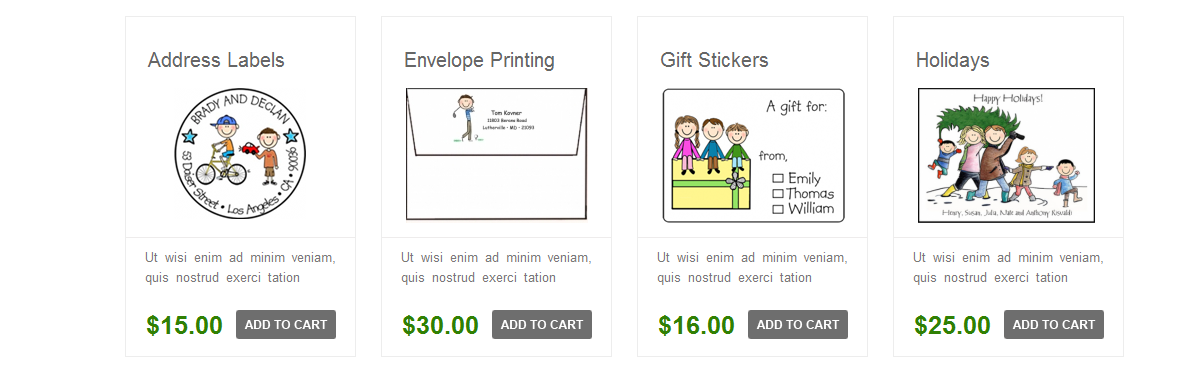
To make this design I use my own css. I modify span size as I need. If you modify span size on bootstrap.css file to make responsive you need also modify at bootstrap-responsive.css file.
There are also many basic css on bootstrap.
You can use those default css or you can modify those css.
Reference website::
http://www.w3resource.com/twitter-bootstrap/tutorial.php